
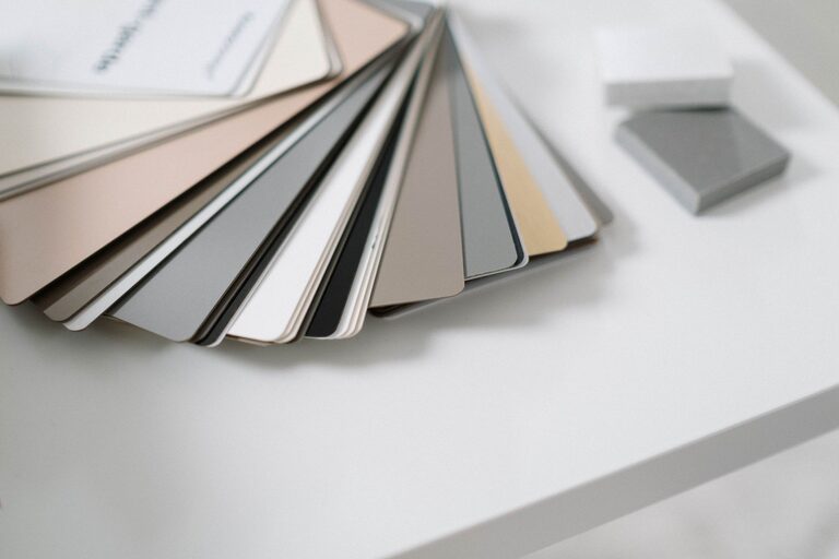

Choosing calm colours for your home can make each room feel more comfortable, balanced, and inviting. Soft shades can help create a peaceful atmosphere, while carefully chosen deeper tones can add warmth and character without making a space feel busy.
The best colour scheme depends on more than current trends. Room size, natural light, furniture, flooring, and how you use the space all play a part. With a thoughtful approach, you can create a home that feels restful and reflects your personal style.
Start with the Mood You Want
Before choosing paint or accessories, think about how you want the room to feel. A bedroom may benefit from quiet, gentle colours that encourage relaxation, while a living room may call for warm and welcoming shades.
Consider words that describe your ideal atmosphere, such as:
– Peaceful
– Cosy
– Airy
– Grounded
– Warm
– Fresh
– Simple
– Comfortable
These words can help guide your choices. For example, an airy room may suit pale blue, soft white, or light grey. A cosy space may feel better with warm beige, muted green, or a gentle clay shade.
It is also useful to consider the room’s purpose. Calm colours do not have to be pale or neutral. A muted navy, forest green, or warm brown can feel just as relaxing when used thoughtfully.
Understand Cool and Warm Colours
Colour temperature can influence the overall feeling of a room. Cool colours include blue, green, and some shades of grey. They often create a fresh, quiet, or spacious impression.
Warm colours include beige, cream, soft yellow, terracotta, and warm shades of brown. These colours can make a room feel welcoming and comfortable.
The difference between warm and cool shades is not always obvious. A grey with blue undertones may feel crisp and cool, while a grey with beige or brown undertones may feel softer and warmer.
When choosing a calm colour, consider the existing features of your room. If your flooring, furniture, or lighting has warm undertones, a warm wall colour may create a more cohesive look. Cool colours can work well with white trim, pale wood, and rooms with plenty of natural light.
Pay Attention to Natural Light
Lighting can change the way a colour appears throughout the day. A shade that looks soft and warm in a showroom may appear cooler or darker at home.
Observe the room at different times:
– Morning light may make colours appear brighter and cooler.
– Afternoon light can bring out warmth and richness.
– Evening light may make some colours look deeper or more muted.
– North-facing rooms often receive cooler, softer light.
– South-facing rooms usually receive stronger, warmer light.
If a room receives little natural light, very cool colours may make it feel less inviting. A warm off-white, pale taupe, muted sage, or soft sand colour may be a better choice.
In a bright room, cool blues, gentle greens, and light greys can help create balance. However, avoid choosing a colour based only on a small sample viewed under one type of light.
Test Samples Before Painting
Paint samples are one of the most useful tools for making a confident decision. Place sample cards or painted test areas on more than one wall, especially if the room receives light from different directions.
Leave the samples in place for at least a full day. Look at them in the morning, afternoon, and evening. Notice how they work with:
– Flooring
– Curtains and blinds
– Sofas and chairs
– Wood finishes
– Light fixtures
– Artwork
– White trim and doors
If you are testing paint, paint a large piece of cardboard rather than a very small section of the wall. This makes it easier to move the sample around the room and compare it with furniture.
Remember that colours can appear more intense when used across a large area. A shade that looks subtle on a sample card may feel stronger once it covers all four walls.
Choose Neutrals with Personality
Neutral colours are popular for calm interiors because they are flexible and easy to combine. However, neutral does not have to mean plain.
Look beyond basic white and consider:
– Warm white
– Soft ivory
– Pale beige
– Mushroom
– Greige
– Light taupe
– Muted stone
– Soft charcoal
The undertone is important. A warm white can make a room feel comfortable, while a blue-based white may feel cleaner and brighter. Neither is better; the right choice depends on the room and the feeling you want to create.
A neutral palette can also include several related shades. For example, you might use a warm white on the walls, light beige textiles, and medium taupe accents. This creates variation without introducing too many competing colours.
Use Muted Colours for a Softer Look
Muted colours have been softened with grey, brown, or white. They tend to feel less intense than bright primary colours and can be easier to live with over time.
Good choices for a calm home may include:
– Dusty blue
– Sage green
– Eucalyptus
– Soft lavender
– Muted teal
– Warm clay
– Smoky rose
– Olive grey
Muted colours can add interest while maintaining a relaxed atmosphere. If you are unsure about using colour on every wall, try it in a smaller space such as a bathroom, reading corner, hallway, or home office.
You can also introduce muted colours through cushions, rugs, artwork, bedding, and curtains before committing to paint.
Create a Simple Colour Palette
A calm room usually benefits from a limited palette. A useful approach is to select three main colour groups:
- **A dominant colour:** Used on walls, large rugs, or major furniture.
- **A supporting colour:** Used on curtains, chairs, bedding, or cabinetry.
- **An accent colour:** Used in smaller details such as cushions, artwork, or decorative objects.
These colours do not need to match exactly. They should simply work well together and share a similar level of softness or intensity.
For example, a bedroom might combine warm ivory walls, dusty blue bedding, and natural wood accents. A living room could use pale greige walls, muted green cushions, and dark bronze or charcoal details.
Balance Calm Colours with Contrast
Too many similar pale shades can make a room feel flat. Add gentle contrast to give the space structure and depth.
Contrast can come from:
– Darker wood furniture
– Black or bronze light fixtures
– Textured fabrics
– Patterned rugs
– Green plants
– Natural baskets
– A deeper accent wall
– Artwork with several related tones
The goal is not to make every element stand out. Instead, use a few darker or richer details to anchor the room.
Texture is especially helpful in a calm colour scheme. Linen, wool, cotton, wood, stone, and woven materials can add visual interest without relying on bright colours.
Consider Colour Flow Between Rooms
Open-plan homes and connected rooms often feel more harmonious when their colours relate to one another. You do not need to use the same colour throughout the entire home, but repeating certain shades can create a natural flow.
For example, a soft green used in the living room might appear again in a hallway rug or kitchen accessories. Warm wood tones, cream textiles, or similar neutral shades can also link different areas.
In homes with separate rooms, you can choose slightly different colours while keeping the same overall mood. A pale blue bedroom, warm beige living room, and soft sage entryway can feel connected when their tones are muted and balanced.
Choose What Feels Right for You
The most calming colour is the one that makes your home feel comfortable to you. Trends can provide inspiration, but your own preferences should guide the final decision.
Start with the colours you already enjoy and identify the shades that make you feel relaxed. Look at your existing furniture and belongings, then build a palette around them.
By considering mood, lighting, undertones, texture, and colour flow, you can create rooms that feel peaceful without looking dull. Take your time, test samples, and allow your home to develop gradually. A calm colour scheme is less about following strict rules and more about creating a space where you feel at ease.